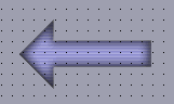
Represents arrow-like button pointing left. Appearance of which is being dictated by an image file; therefore, it may look variously. Interactivity of the component is achieved through an ability of the button image to change when mouse is over or clicked on a component. Label on the buttons may have 3D effects.
After a right mouse click, window of Additional Properties of
a component will open,
where it is possible to set label font, its size and style (bold, italic
or underlined), also to set font color and to create label text to be
placed on the button. An image file that will control an appearance of
the button is being chosen here also.
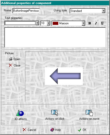
With the help of Open and Close buttons, user may decide to install or not a small graphic glyph that will be placed on the component above the label.
After the right mouse click on 3D effects button,
the same named window will open, where it is possible to set the displaying
image of the component. User can also set one of four 3D effects (lowered,
outlined, raised, shadowed) or leave text plain. For the text with outline
it is also possible to set Outline color and for the text with shadow-Shadow
color.
The given program also enables users to rotate text to any degree towards horizontal.
In Additional Properties window two more buttons are active: Actions on click and Actions on move, meaning that a component may react to the events.